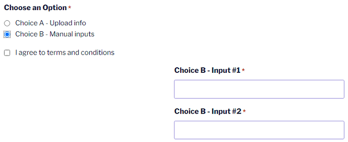
Is there a way to stack multiple fields vertically in each [Row,Column] “cell” of the Gravity Forms [v2.5.15.4] layout editor?
Example: In a desktop-sized viewport, consider a two-choice, 2-“unit”-tall Radio Button field on the left half of the form. Using conditional logic, the right half displays EITHER a 2-“unit”-tall File Upload field for choice ‘A’ -OR- two vertically stacked [1-“unit”-tall each] text input fields for choice ‘B’.
This is easy on [free but soon-to-EOL] Caldera Forms, so I’m hoping I’m just overlooking something as I consider migrating to Gravity Forms.
Or if not supported by the editor, is there a common workaround in CSS or otherwise?
Any help is much appreciated.
@user619d44b12ecec343 it’s pretty easy actually.
You can easily add a two-column layout by dragging the field to the right side of another field. But you need CSS if you want to stack multiple fields on top of each other on one side of the form.
Just add the fields inside the Gravity Forms field editor in order. Then apply the CSS below.
/* Copy and paste this into your WordPress Customer > Additional CSS tab. Add a , inbetween field IDs. Change #field_4_9 to your field IDs. */
#field_4_9, #field_4_10 {
    width: 50%;
    left: 50%;
    position: relative;
}
Thanks Derek. Apologies if I wasn’t clear … Not only do I want to stack multiple fields atop each other on the right half of the form, but (for space optimization reasons) I want that stack to share the same vertical row section as the Radio Button (and Checkbox) fields stacked in the left half.
I tried your suggestion, but it appears to only push the text input boxes right, leaving empty whitespace in the lower left and upper right corners.
GF v2.5 appears to leverage CSS Grid for positioning, so I suspect I need to tweak or replace that? TBD…
You can adjust the vertical position by using top: -75px; See CSS below. Is this what you were needing?
/* You may need to adjust the top: -75px */
#field_4_9, #field_4_10 {
    top: -75px;
    width: 50%;
    left: 50%;
    position: relative;
}
Let me know if this is what you were wanting? We could also target the entire container for each field if you notice any spacing issues after you’ve moved the fields into position.
I think changing the Grid would apply to all elements in the form unless you target the grid for each field, however, with each new field a new grid would exist. The above is cleaner.
You can also, if you have column widths and rows set properly in the form editor, target the one field (Choose an Option) with the following CSS:
grid-row: span 2;

